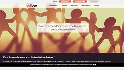
Challenge : Between continuity and disruption
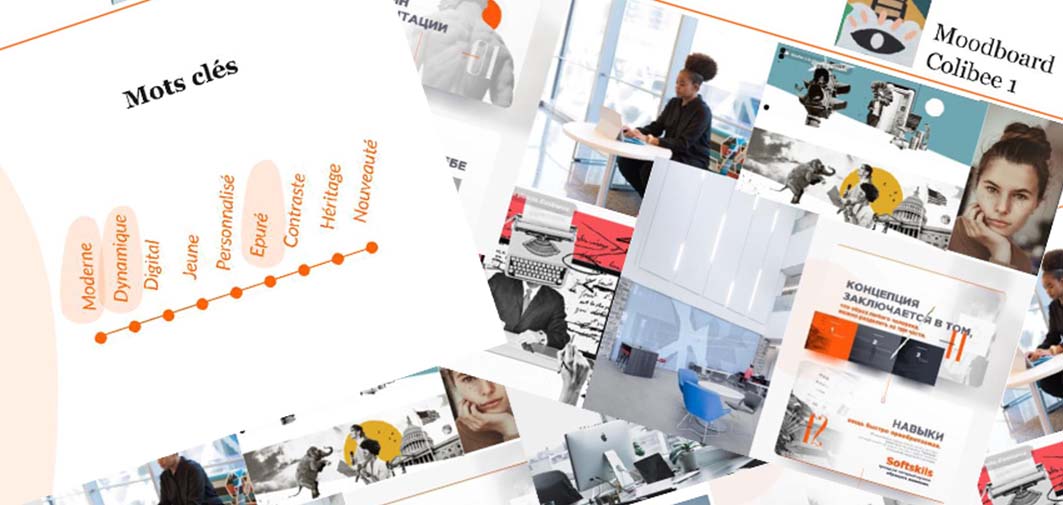
The biggest challenge of redesign is to give the site a new look but alway to keep the continuity of old graphic charter. We can't change the branding color entirely, so we need find the way to use old corporate site and old graphic charter smartly.
Through users investigations, we find what users (consultants &clients) and internal drivers really need.
Clients want to find the right candidates for various missions.
Consultants like to find missions, news services and expand their network.
Company expects the new website could generate more leads and be an excellent advertising tool.
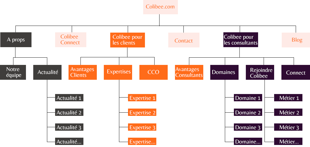
The site audit was considered as a panel study that allowed us to better know the site’s own evolution:
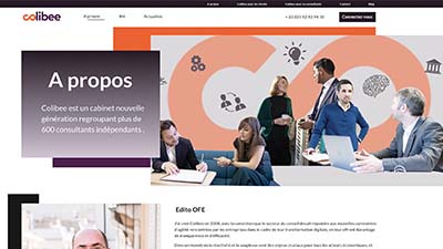
Traditional visual style didn’t do justice to the brand purpose;
Bad structure to the content amplified confusion rather than coherency;
No optimised content that could attract potential users from external research engines,no SEO contents.
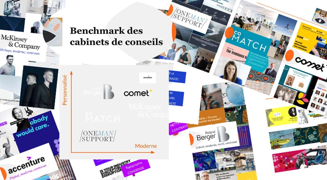
From the cross-study of benchmark, we had a better vision of consulting industry.
Nowadays dynamic and modern sites are very popular on consulting brands. We need to add a different personal touch to be distinguished from them. So an appealing style with continuity of old graphic chart is paramount for us.